BEFORE + AFTER: Downtown Modern Zen Kitchen

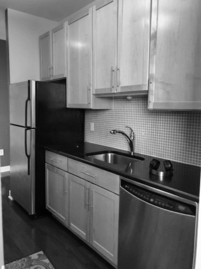
What was once a multi-unit brownstone, reestablishes its glory as a modern elegant single family home in this Jersey City downtown home near Van Vorst Park. Far from tranquil, the old apartment kitchen layout was completely dysfunctional and cramped. Water leaks, heating issues and improper wiring were just the start of a long checklist of improper installations from previous builders.

AFTER

AFTER

AFTER

AFTER


As you can see below, the pantry and appliances were all confined to one side of the kitchen while the other two thirds of the room were left open for a dining table. Since there was enough room for a proper dining area adjacent to the kitchen, we were able to re-configure the floor plan to spread across the entire room.

BEFORE

BEFORE

BEFORE

BEFORE

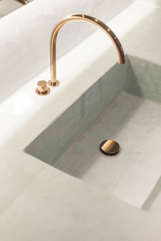
The new spacious floor plan maximized counter space and storage by framing the walls with cabinets and centering the the stove between new, historically correct Marvin windows. To keep counter clutter to a minimum, we custom built a floor-to-ceiling pantry wall fit for appliance storage, dinnerware, non-perishables and more. The island conceals a wine fridge and microwave while the lower cabinet toe kick heaters add comfort for cold mornings.

AFTER

AFTER

AFTER

AFTER

To achieve the balance of historic character + the clients appreciation for zen design, we installed custom built, traditional in-set shaker cabinets from Decora and white quartz counters & backslash with slight gray veining. To add warmth, we installed white oak floors and floating shelves. JennAir appliances and Kohler sink and faucet complete this sophisticated modern-zen kitchen.

AFTER

AFTER

AFTER

AFTER

To see the entire project, check out the full set of photos on our Projects page and Houzz.com.

BEFORE + AFTER: Updating a tight shaker kitchen and bath

We just wrapped up another kitchen and bath project — and this one’s all about letting the light in! The original kitchen was extremely closed off from the bright, open living room with a dated half-wall and bar-height countertop. Another unnecessary wall made the entry feel cramped, and tightened the space within the kitchen even further. Thanks to a washing machine leak that flooded the entire room, we were called on to reimagine the layout and make it more workable for this busy family.

AFTER

AFTER

AFTER

AFTER


As you can see below, the extra walls closed in the space, making it feel much smaller than it really is. To open up the flow, we eliminated both walls and repositioned the fridge against the back wall. This allowed up to accommodate an island that houses a drawer microwave, making room for a true hood over the range.

BEFORE

BEFORE

BEFORE

BEFORE

We stuck with white shaker cabinets and opted for a light gray subway backsplash to complement the veining in the quartz countertops. To create a more functional entryway, we shifted the laundry and closet doors over to make the pantry more accessible. It also made room for an additional full-height pantry cabinet, which helped to increase their original storage space.

AFTER

AFTER

BEFORE

BEFORE

Next up, we tackled the master bath. To make room for a double vanity, we swapped the sinks to the opposite wall, which also allowed us to make the shower stall much bigger. We added extra storage will a tall linen closet built-in and unified the space with light gray tile, a marble mosaic, and pretty gray painted cabinetry.

AFTER

AFTER

AFTER

AFTER

AFTER

AFTER

AFTER

AFTER

To see the entire project, check out the full set of photos on our Projects page. Thanks for following along, can’t wait to share the next one with you!

BEFORE AND AFTER: Opening up a Galley Kitchen

It's true! We've got yet another finished project and this one's reallllly good. This time, it's all about knocking down walls in the name of an open concept and letting in some sunlight. Actually, that's an understatement—it's a TON of sunlight...

Our clients tight galley kitchen was planted smack in the middle of their living room, which is entirely surrounded by bright, massive windows and views of the city. Not only was cooking difficult with no prep space and little room to move, but it was closed off from the very best feature of the apartment! Our clients like to entertain, so they called us in to rework the limited space and create something ideal for gathering friends and family. 

AFTER

AFTER

Of course, everyone was in agreement that the walls needed to come down. But without a full-height wall, we had no way to run electricity to the new island. Since ripping up the floor wasn't an option, we decided on decorative columns to house the wires, allowing us to power the appliances (both the range and microwave drawer) that live in the island. We ran the counter and cabinetry the length of the back wall and added an overhang for stools, doubling their prep space and making it a place for guests to hang out or even pitch in.

BEFORE

BEFORE

Our clients were tired of the old builder-grade wood cabinets and dark countertops. They opted for white shaker doors and brought the cabinetry much closer to the ceiling to maximize storage space. Low maintenance quartz counters add the look of marble without the risk of staining or etching . Inspired by some of our past projects, they chose to carry the island counter over the edge with a waterfall treatment. Then, they wrapped it up the back wall to use as backsplash, too. Fewer grout lines mean less cleaning!

BEFORE

BEFORE

AFTER

AFTER

To stay within budget, we decided to keep almost all of the appliances in the same location and simply upgraded them.  A taller counter-depth fridge gained our clients space without eating up any countertop, and a drawer microwave was easy to hide within the island. Since we kept the oven in the same spot, we chose one with a downdraft so we didn't have to block the view with a bulky hood vent. 

BEFORE

BEFORE

AFTER

AFTER

Another benefit of maintaining a similar layout? We were able to salvage most of the original flooring! There were a few places that needed patching, so we borrowed wood from underneath the cabinets to ensure a perfect match. 

BEFORE

BEFORE

AFTER

AFTER

Ultimately, removing a few walls and planning the cabinetry strategically made for a brighter, open space that finally feels inviting. Now, anyone cooking can enjoy natural light and beautiful views, all while keeping up a conversation with whoever is hanging in the Living Room. To see more of this bright, beautiful space, check out the full project here

Autumn Interiors

We're huge proponents of summer (long weekends, longer days, and outdoor projects!) and we like to drag it out as long as possible. But this year, the never-ending humidity has us wishing for cooler days and cozy design accents to match. So, we sat down (in our very air-conditioned office) to round up our favorite ways to usher in fall. Here they are—and here's hoping for at least a 75 degree day sometime soon...

MIXING OLD AND NEW

We love to incorporate a client's furniture or collected accessories into a design, especially when the piece has a good story or interesting provenance. As we renovate and install new cabinetry, flooring, appliances, etc., a space can seem cold without accents that show their history. This antique table, for instance, is the perfect foil to the sleek waterfall countertop and plaster hood. It makes you want to sit down and offer to help make dinner...almost.

PLAID AND PLASTER

The above photo is a two-for-one deal. First up—an easy way to instantly transition any room from late summer to early fall. Plaid pillows, throws, even dish towels in rich, earthy tones (think persimmon, deep indigo, aubergine and saffron) add an autumnal layer. Choose lightweight fabrics like linen to keep them from feeling too stuffy.

And speaking of keeping things light—how about this insanely beautiful wall treatment? Though it's not new, plaster is subtly making its way into more than just traditional homes. Not the heavy-handed venetian plaster of the 90's, this gently textured application creates the perfect cozy backdrop without the need for wallpaper or excessive trim work. It has a similar look to the lime wash paint we mentioned in another post, but requires a different application. Since it's hand done, every wall is essentially a custom work of art. It's one of our favorite projects to accomplish, so let us know if it's something you're considering! 

STATEMENT STONE

Yes, we already did an entire post on our love for natural stone. But this season, we can't get enough of the crazy-strong veining mostly found in marble and quartzite. From fireplaces to countertops to furniture, this bold look commands a whole room (which is why it's best to let the rest of the space remain simple and clean-lined).  And while not everyone has a brownstone with original marble mantels to restore, we can all get the look. Our favorite trick? Try visiting your local stone yard to browse the remnant section. If you see something you like, have them trim it down to fit the top of a side table or nightstand. Minimal cost, big impact!

PROMINENT PENNY TILE

Every time we have a new client renovating a bathroom, our project manager crosses his fingers and asks if they've agreed to a room full of penny tile. Why? Just look! Sure, it makes a great shower floor, but it's so much more compelling when you get this much of it. Instead of being busy, the repetition creates a sense of calm and allows your fixtures to be a focal point. What's more inviting than a warm, welcoming shower after a crisp, chilly day?

STRONG SINKS

Last but not least is another double-header. Integrated sinks are making us swoon this season. Choose a lovely countertop stone, then keep things seamlessly sleek with a sink made of the same material.  Perfect for pre-washing all those squash and pumpkin rinds you're roasting this time of year.

And finally—the one trend we're on the fence about. It's polished brass, and though we're hesitant, we also kind of like it. Sure, it still brings back memories of every cherry kitchen from 1998, but this time around the profiles are sleeker. In a more modern silhouette (think plain, unadorned designs), this once-banned finish is sitting pretty again. We've yet to convince a client, but it's on our radar.

What do you think? Any trends you can't get enough of, or want to avoid at all costs? Tell us in the comments below.